


Typography systems in Figma

Typography forms the foundation of a design just as much as colors and components do. As a result, you'll need to establish patterns for consistent, legible typography early in the process of creating your design system. Doing so will make it easier for you to scale typography across multiple applications and devices, without complicating the handoff between designers and developers.
In this article we cover what you should think through when it comes to working with type in Figma. We'll offer workflow suggestions to make the process of using and implementing text styles more efficient for both designers and developers.
Text style basics
The text styles functionality in Figma makes it easy to repeatably apply a collection of properties (like line height and size) to text objects in Figma. You can put these styles into a library, then easily share them within your team or across your organization.
Text styles remove much of the guesswork and variability from the design process. If one of the text parameters needs to change as part of an improvement or redesign, then you can push updates to these styles across all files where they have been used (simply by publishing an update to their original Figma library).
Before we continue, I'll briefly outline which properties are part of Figma's text styles, and which aren't.
Properties defined in a Figma text style
- The font family, weight, size
- Line height
- Letter spacing, paragraph spacing, and indentation
- Decoration (strikethrough and underline)
- Transform (uppercase, lowercase, and capitalization)
- Other Open Type features (tabular figures, small caps, etc.)
Properties not included in a Figma text style
- Color
- Justification (left, right, center, or justified)
- Text box alignment (top, middle, or bottom)
- Text box resizing (horizontal, vertical or fixed)
If you're used to working in another design tool, you may find it strange that your text styles in Figma don't include traits like color or justification. Although it could take some getting used to, hopefully the benefits of this approach will quickly become clear.
When you maintain styles in a simpler format, it reduces the amount of time you have to spend creating them — you no longer have to account for all possible combinations of text, color, alignment, and so on. It also reduces the work required to maintain them, because you ultimately have less styles you have to update if something changes in your system. If you need right, left, and center aligned text, you can configure these properties separately from the style.
Specifying fonts
To standardize type across your designs, you'll want to establish a system of fonts, with specific sizes and line heights. Generally speaking, your standards will need to capture everything from large display typography for headlines, to smaller sizes for body copy. You'll need enough variety to support all of these use cases, but not so many options that designers don't know when to use which styles.
Specifying fonts
A lot of factors go into the decision of which fonts to use in your system. You should consider things like:
- App performance: Do you have a performance budget? How many fonts do you need to load? Will you leverage fonts that are already-installed on different platforms?
- Personality: Do you have established brand fonts as part of your company's visual identity that makes sense to use?
- Multiple systems: Decide if it makes sense to have one unifying type system or different strategies for different use cases: for instance in-product vs. marketing website (where brand-personality may carry more weight).
- Pairings: Can you get all of the typographic range you need in your system from one font family? Consider pairing typefaces. You can reserve more decorative fonts for large-sized text that you use sparingly, and keep legible typefaces for body copy. If you're using free Google fonts, we also have created a resource to help you easily explore a variety of possibilities with these pairing palettes.
Setting line height
In addition to choosing the right fonts for your system, you'll also need to specify the right line height pairings for them. For example, you should take a different approach to setting line height with body copy than the approach you take with headlines. Below I provide more detail on what to consider in those two use cases.
Body copy
To make typography in body copy readable, you can afford to have a bit more space between the lines. Body copy is text dense, and users will sometimes spend a long time reading it. As a starting point for figuring out the right line height, I recommend multiplying the font-size of your body copy by 1.5. Then evaluate whether that's legible enough.
Optical effects
In figuring out body copy line height, you should also consider the color scheme of your text and its background. Do you have a positive application (dark text on light background), or a negative application (light text on dark background)? A style with the same properties can look different depending on the context and resulting optical effects.
For example: In Figma's own design system, we have separate text styles for both positive and negative applications. The main difference between these styles is a slight change in letter spacing that opens up the space between letters for styles intended for use on dark backgrounds.
Headlines
With display sizes, you won't need as much space between the lines or letters of type as you do with body copy. So, you will generally want to reduce the line spacing as you get into your headlines. If the typeface you're using has a specific variant for display sizes, the designer of the font has most likely tightened up the spacing as part of the design.
While choosing, I recommend setting up a type waterfall to arrange your text sizes from largest to smallest. That will give you an overview of the complete system.
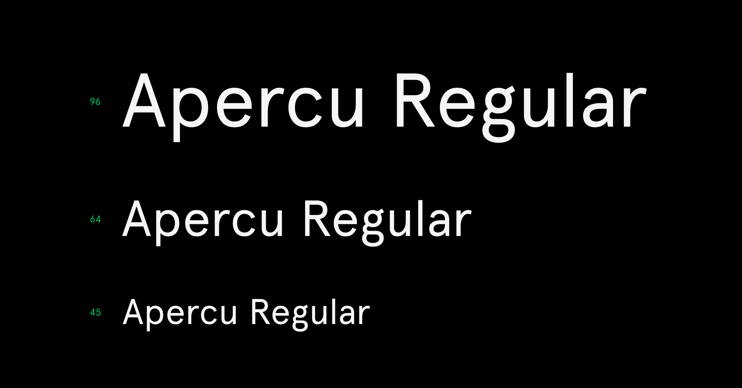
Typography scales
There is no magic number that defines how many styles or sizes you will need — for example, in this article creative director Dan Mall details his experience getting a lot of range from just 7 sizes. That could be a great starting point.
There is no shortage of philosophies on how to determine what these sizes will be, but here are a few common approaches (along with relevant links to learn more about each of them):
8-point grid with 4-point baseline system
Overview: In the 8-point grid system, everything is spaced and sized using numbers that are multiples of 8. Designers will often use an 8-point grid for spacing and sizing with a 4-point baseline grid for typography. The type baselines will sit on on the 4-point grid. In order to achieve this, the focus here is really more on the line-heights than the exact font sizes.
Purpose: In this system, the goal is for all of your line height values to be multiples of 4 so they correspond to your grid spacing. This makes it easier to establish vertical rhythm (top and bottom spacing between elements) and maintain vertical alignment of text across columns.
Pros: This is one of my favorite approaches to establishing typography scale. The math is easy when adding, subtracting, dividing, and multiplying values. Moving objects around the canvas during the design process can be greatly simplified by adjusting your "big nudge" setting to 8px in Figma.
Tip: While this approach can feel rigid, my recommendation is to use 8-point grids as a guide for the design process, but not necessarily reinforce them to the nth degree when QA-ing your designs in production. In code, there is no underlying grid that objects snap to. That, combined with the wide-variety of device resolutions (which are not always divisible by 8), will undoubtedly throw some of your measurements off slightly!
Overview: In this approach, a base font size is selected (usually the size you will use for body copy). As a starting point, many will use browser defaults and start with 16px (or 1 rem). From there, font sizes are calculated based on a specific multiplier. There are lots of common ones: some based on the golden rule and others based on musical scales (fifths, fourths, thirds, and seconds).
Cons: If your eye starts twitching at the unpleasant sight of type sizes that contain multiple decimal points, this system may not be for you 😅. It's my least favorite, but a worthy approach to use as a jumping off point.
Tips: With the modular scale, some multipliers (for example, using the golden rule as shown below) will yield font sizes and line heights that are not whole numbers. How you deal with this is up to you: one option is to round to the nearest whole number. In Figma, if you have pixel-snapping turned on, the height of your text boxes (based on the line height) will get rounded to the nearest whole number. If you don't want this, make sure you disable pixel snapping.
Dev handoff: In production these nuances will be less of an issue, however, if all of your text box sizes in Figma don't fall on whole numbers, it could be a major nuisance for developers who are inspecting your designs (since they won't see whole numbers when measuring distances to and from text objects). My recommendation is to explore tools like modular scale or type scale and use the results as a starting point. These tools are great for quickly visualizing a range of sizes and can help you determine how legible they are at at various sizes.
Beware: You will find that as your multiplier increases, especially in excess of 1.4 or 1.5, large sizes will get get really big, often too big! (as shown below). Line heights calculated by the tools will follow suit, so you may choose to use a different ratio for display sizes and line heights separately from smaller font sizes.
Overview: In this approach, type sizes are defined in pixels but line-heights are defined as percentages. This works on the same principal as modular scale, but is much easier to implement (especially if you keep font sizes and percentages to nice round numbers).
Pros: With this method, you don't need to explicitly set each line height (for every size) to different values. For example, you could set all your smaller styles to 150% and the actual line height will calculated as 150% of the specified font size.
Beware: While it may be tempting to keep things simple by using the same percentage value for all sizes (like using 150% x every font size, whether it's font size 12 or 100), when you move up to larger type sizes this can result in unattractive combinations. When the font size gets bigger, so do the spaces between the lines, and you wind up with issues like headlines spanning two lines (and feeling disconnected).
Tip: In this case, you may decide to have 2 (or even 3) different percentages to use between body sizes and headline sizes. The example below was modeled after Figma power user Jonathan Simcoe's percentage based approach which you can learn more about here. You'll see a shift in the line height value from 150% down to 110% as you get into the larger sizes that are used for headings and subheads.
I suggest you spend some time exploring these three different approaches. When you can quickly compare options side by side on the canvas in Figma, you'll get an idea of what works best. I also recommend you stress test different options in real-world screen layouts to solidify your approach. Once you land on a set of fonts and sizing, you can start creating your type styles in Figma, and subsequently publishing and sharing them out for your teammates to use.
Next we'll cover some suggestions for naming and organizing your text styles.
Naming and organizing text styles
Naming text styles
The right name can help designers understand when and where to use a text style, as well as help developers identify if the typography they are implementing already exists as part of the design system.
Go through the process of naming your text styles in tandem with engineering to ensure consistent terminology between your Figma designs and production code. The names of text styles will appear in the code mode view in Figma, both as a comment in the CSS view and as an itemized style name in the table view. Coordinating your text style names with your engineering team in advance will greatly simplify the hand-off process.
You can take a few different approaches to naming text styles:
- Sized-based naming system (XS, S, M, L, XL)
- Semantic naming system that corresponds to respective html tags in production (caption, paragraph, h1, h2)
- Descriptive or functional naming system that explains the styles' intended use (alert, modal-header, button-label)
The descriptive naming approach can help you communicate where these styles get used. That said, you'll likely wind up creating more styles with this approach (since some styles may share the exact same properties) hidden behind a more descriptive name to help communicate their intended use.
Organizing text styles
The power of prefixes
To make your styles easier to browse, you can prefix your style names with a forward slash (prefix/style-name) which will group your styles under subheads in the style picker.
Separate libraries
The more text styles you add, the longer the style picker list will be. To make it easier to parse, you may want to consider sharing your text styles from separate libraries instead of one centralized library. It's worth breaking them up if the designers are using different styles for different projects, that way they don't have to scan through styles they won't need.
For example, let's say you have a separate set of type styles for mobile native from text styles targeting responsive web. You'd probably want those styles in two different libraries, so people working on a responsive web project can just turn on that specific library.
Combining color styles and text styles
As I previously mentioned, color is not part of a text style in Figma, but you can apply a separate color style to a text object, or even highlight and apply multiple color styles to different selections of text (in the same text box!). Although applying the color style is an extra step, your system will be much easier to maintain when you don't have to create a text style for every possible color combination.
With the growing need for accessible colors in design, many teams will define color pairings for text and background color. One strategy for creating these pairings is to save color styles specifically for text; then use the style descriptions to indicate the corresponding background color they are intended to be used on top of.
Another approach to managing color pairings is to build components. This is particularly helpful if you have consistent text arrangements that get used throughout your designs.
For example, if you had a particular text and color arrangement for pull quotes in your product, you might apply all of the necessary text and color styles to a sample pull-quote object, and componentize it into an easy to re-use component. Even if designers find the need to detach the component to change the actual text, all of the text styles will still be applied.
Text box resizing behavior in Figma
Whew — still with me? We've covered a lot, but we're almost through it all. Once your text styles are ready to go, I have one last useful tip.
When creating text boxes in Figma, there are three main resizing modes that can be applied to them:
- Grow Horizontally (the default when you click once to make a new text box)
- Grow Vertically
- Fixed (the default when you click and drag to make a new text box)
At early stages of your project, there is a chance some of these properties may change. For example: if you had a text box set to grow horizontally, resizing it vertically would automatically change its mode to "Fixed". These things will always happen during the more exploratory phases of a design when you're less concerned with accuracy.
As you get closer to production and start to tighten up your design, I recommend setting text boxes to "Grow Vertically" wherever possible before going to production. Using this setting will ensure the height of the text boxes is sized based on the line height specified in your font-style. When you switch to this mode, a text box that is sized too tall for its contents will automatically resize to the height to fit.
Why is this important? When developers are inspecting your files, they need to be able to accurately take measurements between text objects and other objects on the canvas. If text boxes are not sized accurately, spacing between elements will undoubtably be off once implemented.
For example: In the video below we have a headline with a font size of 48px and a line height of 64px. The text box was resized manually in the example on top (which changed its resize behavior to fixed). Instead of having a height of 64px (defined by the line height), the height has been set to 74px by means of resizing.
When a developer inspects the file to understand how far apart the two text objects are, the distance is calculated from the bottom of the text box containing the headline, showing a distance of 6px. In code, the height of the headline will be calculated based on the line height (which in this case is 64px). So in reality, the elements are going to end up 10px closer together in production and appear to be visually inconsistent with what the designer intended.
In the second example, by setting the resizing behavior to "Grow Vertically" we can see the height is adjusted to respect the line height value of the text style. Now, when a developer inspects the distances between the two objects, they can see the spacing is 16px—a more accurate representation of the relationship between these elements as it would be in code.
If you want to learn more about resizing, our help article covers this in great detail, and if you want to learn more about our recent improvements to how we handle line height, make sure you check out this post.
Time to start chasing waterfalls 😅
I hope some of these considerations will be useful in setting up a strong and long lasting set of type styles as part of your design system. As always, feel free to share your tips, approaches and experiences in our online community on Spectrum.