


Tips for a better developer workflow

When I switched to Figma, my experience working with developers totally changed. Instead of handing off designs to them at the end of the process, I was able to involve them from the beginning. From the moment I started wireframing, I'd share the Figma URL — which stays up to date since Figma files are on the web — and they would give feedback and ask important clarifying questions. The resulting conversations shaped the designs in meaningful ways. It also helped us avoid any big surprises when designs were ready to be implemented in code. (I like to say Figma took me "from handoff to handshake" 😉.)
Because developer collaboration is such an important part of the design process, we're committed to evolving and improving the experience in Figma. In the past couple of weeks we made some small but important tweaks to support collaboration with engineers. In this article I'll highlight a couple of these changes and share a few tips that many of our users have found helpful in their own workflows.
Help developers understand more about your components
View-only users can now go to main components
One of our latest updates makes it easier for developers to discover where components come from. Even if they have view-only access, they can now select a component instance and choose "go to main component" from the context menu (or alternatively in the code view of the right-hand properties panel) just like editors of the file. Figma will then take them to the location of the parent component, whether it's located in the same file or a different one.
By seeing where the component is coming from, the developer has more context. They can deduce whether a component is part of the official design system or if it's a new element created by the designer for this specific project. That helps them figure out whether it already exists in their system, or if it needs to be built from scratch. In comparing the main component to the instance, the developer can also better understand the nature of the overrides that were applied to the instance.
If you think this new functionality will be useful, make sure developers on your team have view access to your libraries as well (otherwise they may get taken to a file where a main component resides, only to arrive at a 404 error 😆 ).
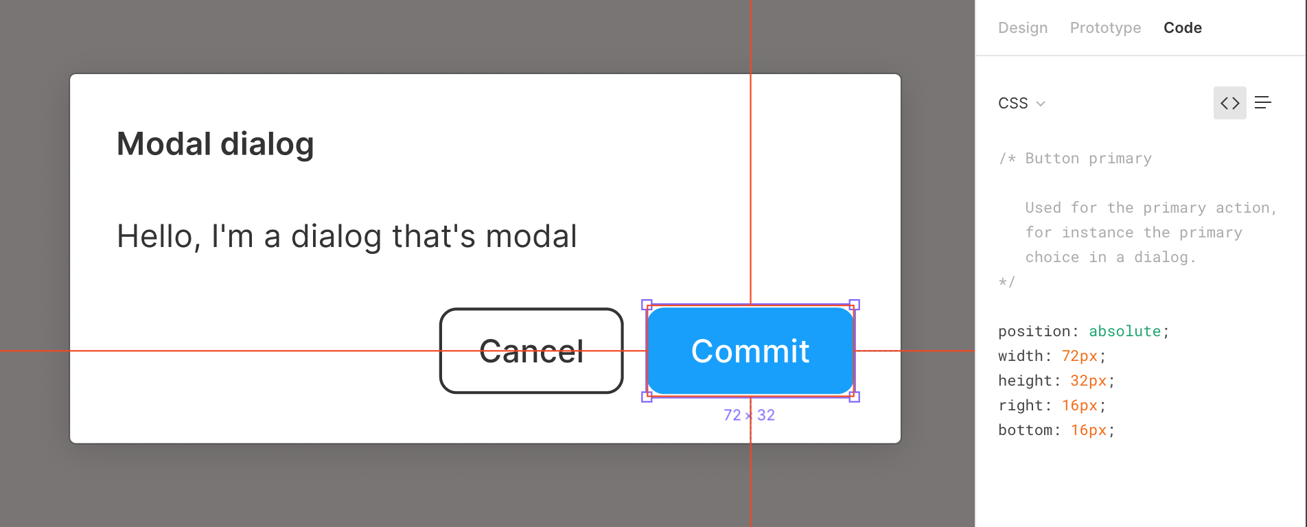
Component descriptions in the code panel
The second tweak we made is with component descriptions. We now show them in the code panel, so developers can review any information you include. I recommend adding details here that will help people understand how a component fits into your design system.

You might include:
- Actual component names from your code base (or a clear way of identifying the name and state of the component depicted by the instance)
- Relevant hyperlinks to code repositories
- Documentation that describes proper usage
- Explanation that a component is local to the file and not part of the broader design system (assuming you created a component like that)
Helpful tips for better designer and developer collaboration
We hope those little updates make your 'handshake' with developers go more smoothly! In addition, I wanted to share a collection of tips that have helped me collaborate with engineers in Figma.
Naming styles
When you're creating type, color, and effect styles, give them names that align with color names you're using in code (for example, token or variable names). Developers will then see these names in the code panel in Figma. They'll surface as comments in the CSS view, and as line items in the table view. This can enable developers to implement variables in some cases, rather than hard-coded values (like hex values) that might exist in their system.
Some teams may even take a functional approach to naming their styles. This method can be useful for adding a layer of semantics to the naming scheme. For example, you could name a color based on its hue, but that wouldn't describe its intended use case. Teams who choose instead to implement a functional naming system add a level of abstraction to their naming to ensure proper usage for both the designer and the developer. For example: a drop shadow named $modal-shadow or color named $alert-warning makes it clear which style to use where.
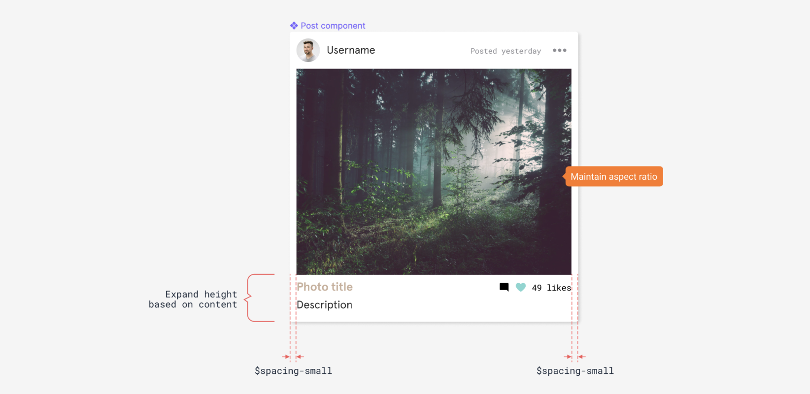
Helper components for redlining
Figma has built-in contextual visualizations to display redlines for measurements and distances. Viewers can access them by selecting elements and hovering over other elements that they want to measure the distance between. This can reduce most of the arduous effort associated with manual redlining when creating specification docs for developers.
But sometimes it can be beneficial to add annotations or manual redlines to the canvas when you want to provide additional information. I recommend doing so when you want to:
- Highlight an area of your design that will be fluid when resizing
- Indicate margin/padding
- Annotate a design with other variables/tokens that you want developers to leverage during implementation.
Some users have created a library of scalable components to aid in this process. Figma power user Anton Lapko has created an awesome redlining kit to get you started.

Clearly indicate what is ready for development
It's good practice to clearly communicate which parts of your work are ready for implementation. That way, you don't send developers deep sea diving into your designs to figure it out for themselves. There are many paths to communicating the 'ready file' status in Figma. Here are a few ways we've seen teams do it:

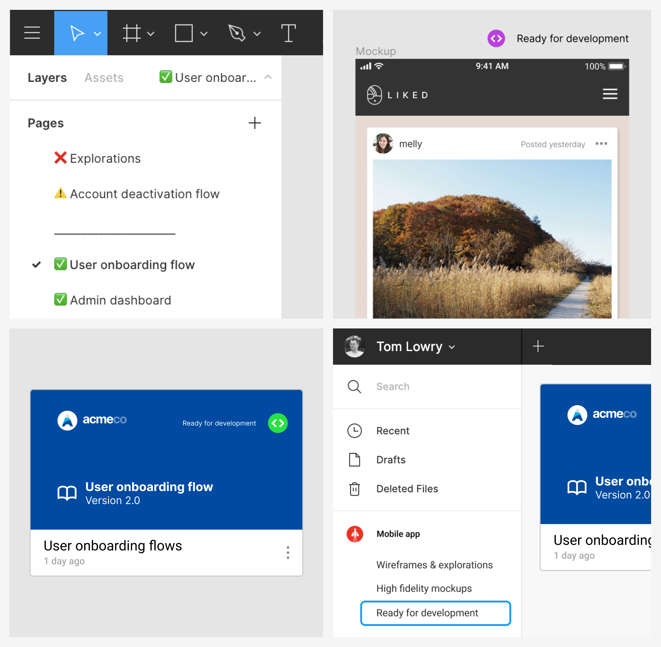
- Dedicated pages that are ready for development—some teams even use emojis in page names to help quickly distinguish in-progress work from work that is ready to go 🚀.
- Use sticker components—many teams have created libraries with icon or sticker components that they can place on the canvas to help indicate which screens or mock-ups are ready to build.
- Cover pages—The first page of your file can be turned into a cover page. Many teams have devised a cover page system to indicate project status (through colors or some sort of badge or label) if their workflow includes handing over an entire file or spec that is ready for development.
- Dedicated projects—Companies using Figma Organization have the ability to create unlimited teams which can enable an additional level of file structure. This means projects could be used like sub folders. Developers could be invited into a "Ready for development" project within a company-wide team, where any files ready for implementation get moved.
Moving forward collaboratively
When you invite developers into your projects earlier, you create more transparent workflows and ensure no one is left in the dark. Developers can then ask clarifying questions throughout files and flag any potential issues early instead of at the time of implementation.
We hope this recommendation, combined with some of the improvements and tips outlined above, will streamline your process of going from concept to implementation. If you have more tips and tricks that have helped your workflow, please share them on our online Spectrum community!